Allowing physicians to review medical documents on their phones
Mobile Inbox
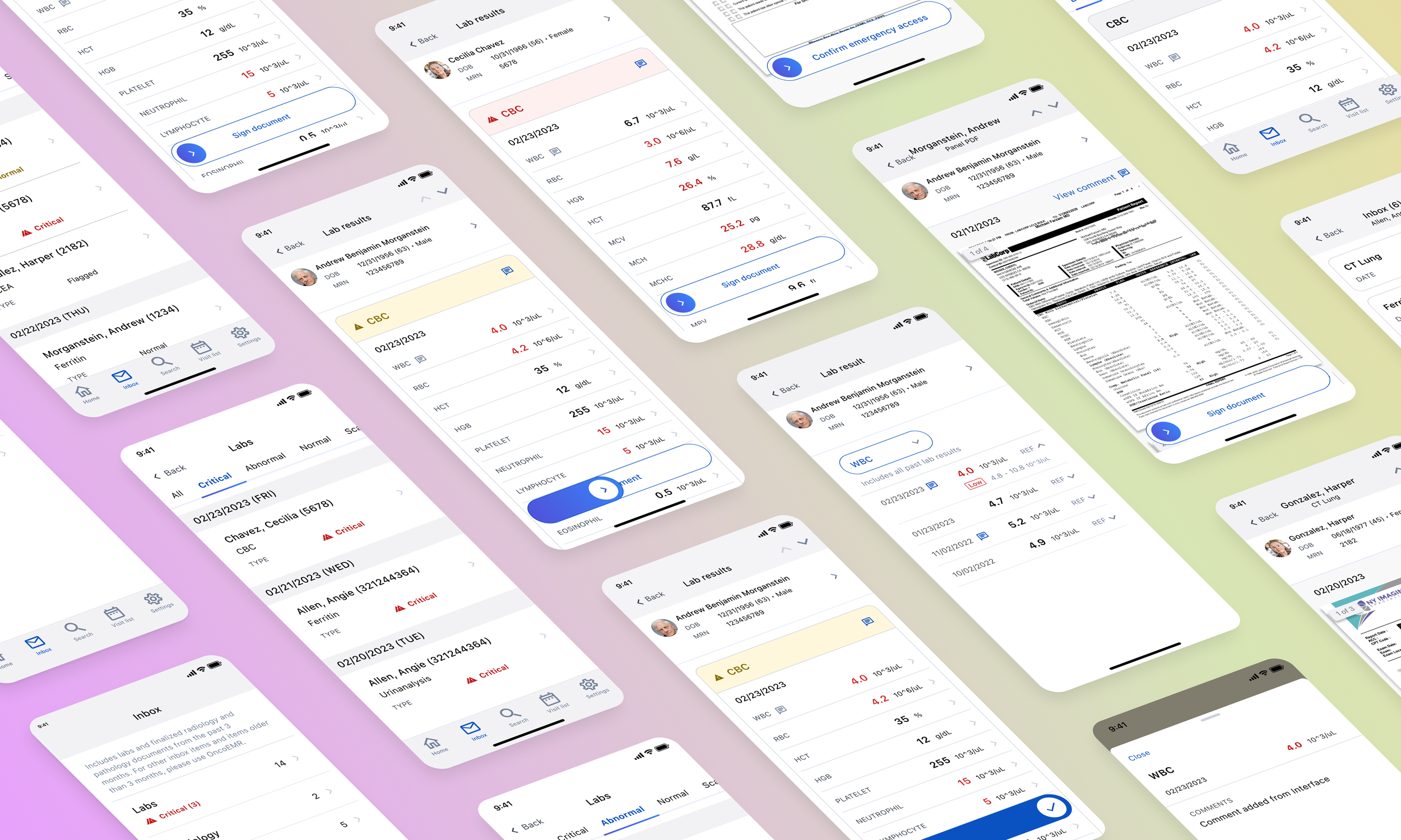
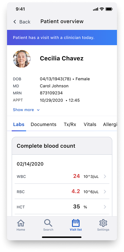
OncoAir is the mobile companion to OncoEMR, providing physicians with secure access to patient information on their phones. As a new product, OncoAir supported three workflows: Homepage with recent patients, Search for patient lookup, and Visit List to support daily rounds.
However, physicians have no way to manage their inbox when away from their desks. Previous research from the Inbox redesign project indicated physicians want to review critical documents (labs, pathology, radiology) on their phones. Accessing important, time-sensitive items on-the-go would enable physicians to leverage it in patient care.
Timeline
Q3 2024 - Q1 2025
Role
Senior Product Designer
Team
Product manager
Clinical lead
Data analyst
4 mobile engineers
Target users
Physicians
The problem
OncoAir is Flatiron’s mobile app, launched as a streamlined, read-only version of OncoEMR. However, physicians frequently requested the ability to also take action on documents, not just review them.
The solution
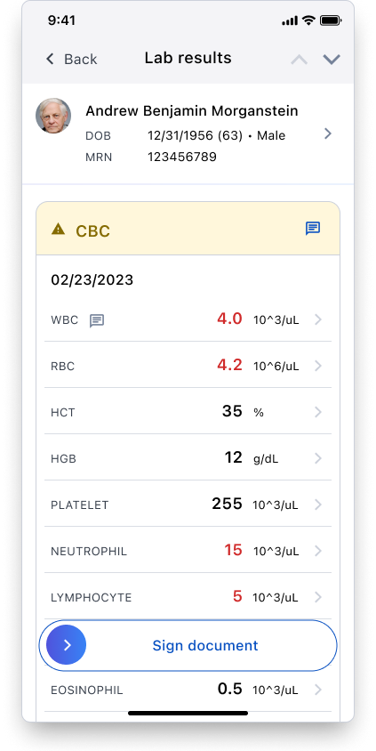
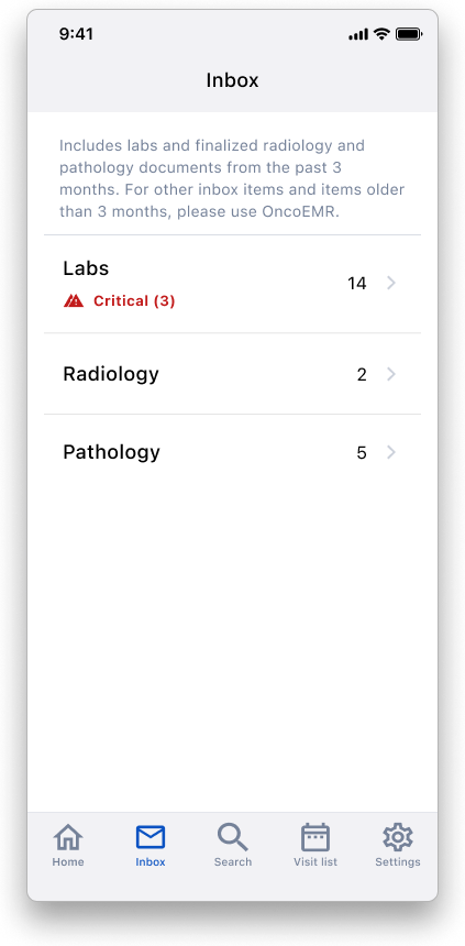
We introduced an Inbox page in OncoAir - building off the desktop experience to create a mobile flow that supports sign-off for the three most urgent document types: labs, radiology scans, and pathology reports.
Impact
Aside from improving overall physician satisfaction, this product aimed to increase engagement on our mobile app and support future product investment in OncoAir.
To translate qualitative product goals into measurable outcomes, I collaborated with Product Marketing to determine metrics for defining success.
Our quantitative targets focused on three areas: usability (sign-off rates, session length, time-to-action), engagement (adoption, retention, daily usage), and satisfaction (CSAT).
Usability
Reduced backlog (50% of urgent documents signed off after being viewed, 30% reduction in documents pending beyond 48 hours)
Efficient session length (<2 minutes per document)
Faster time-to-action (20% decrease in time elapsed from document arrival to sign-off)
Engagement & satisfaction
50% adoption within 3 months (at least one session per week)
20% retention (users returning at least 3x/week)
30% of monthly active users engaging daily
CSAT score above 7 (out of 10)
Design Process
01 Learning from users
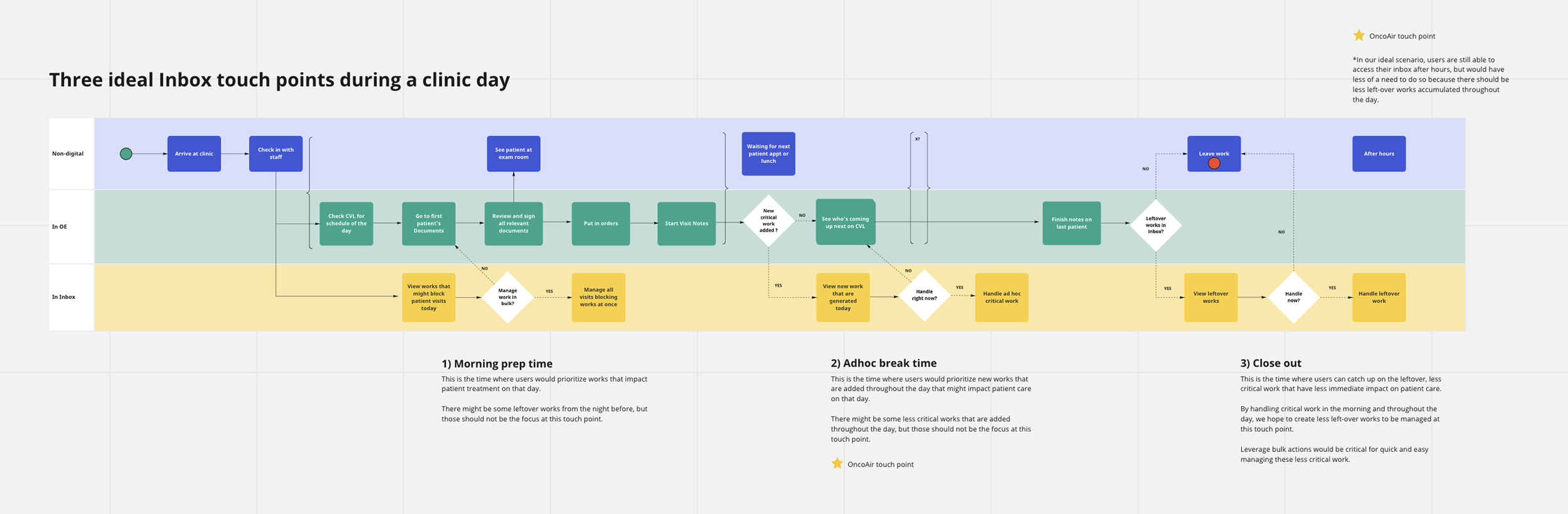
…auditing the existing experience (currently a workaround) and examining when users use the app during the day.
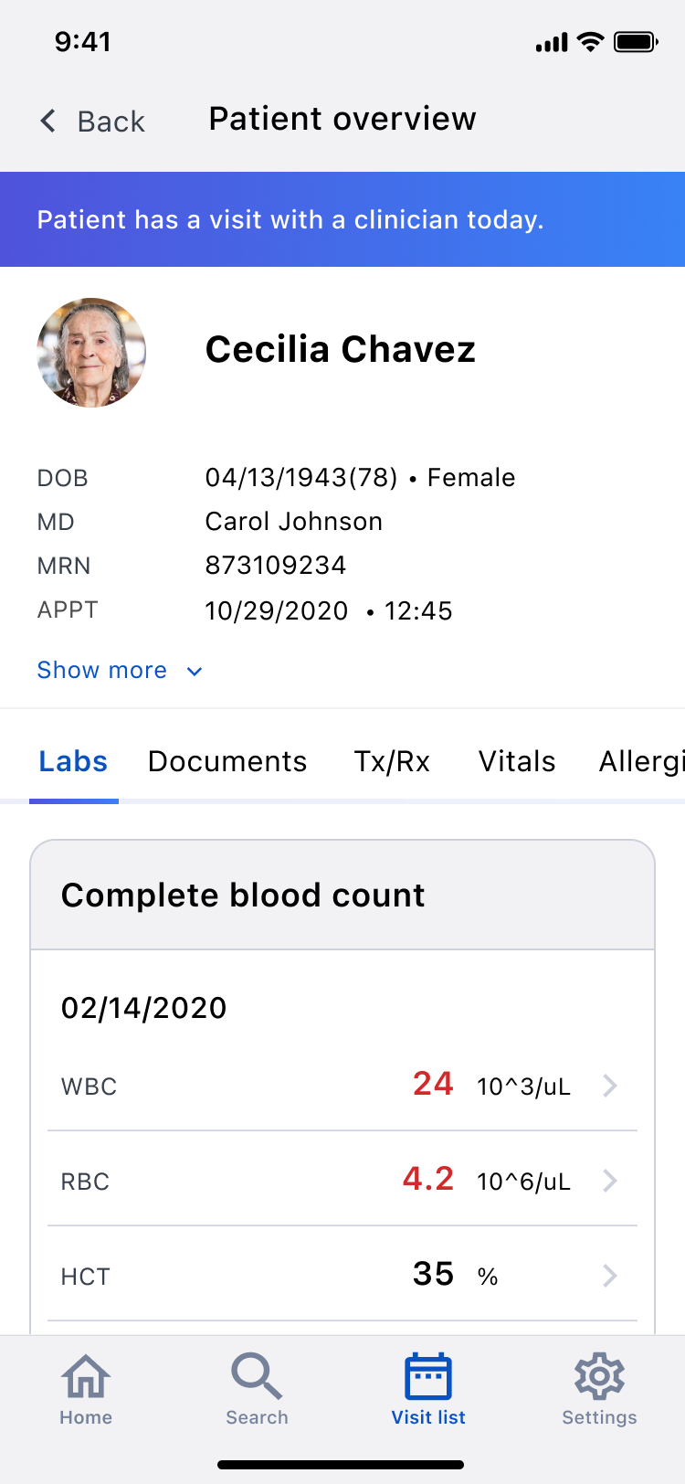
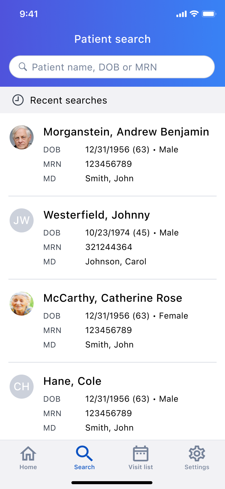
→
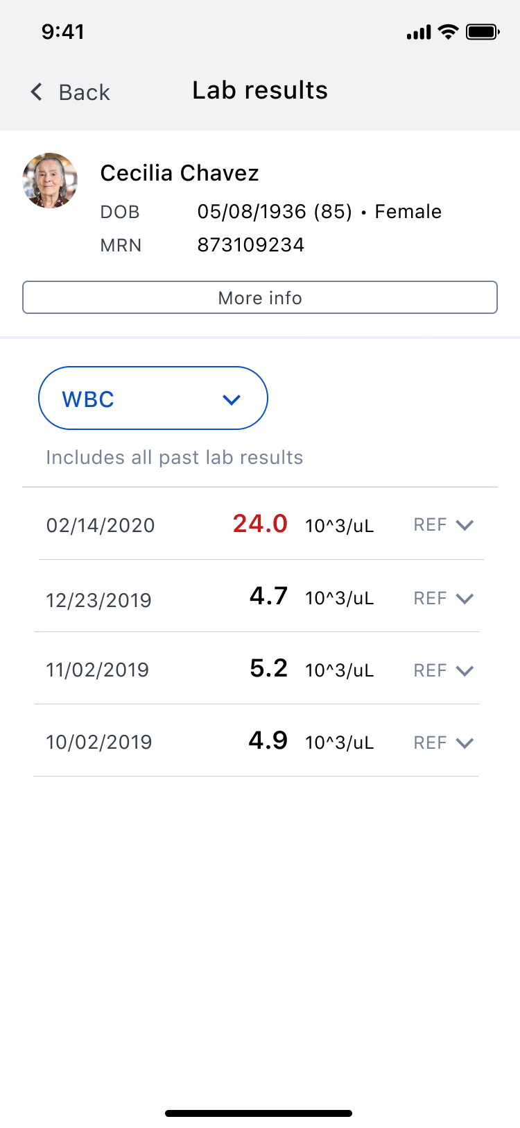
→
and review a lab individually.
Physicians must search for a patient…
to access the patient’s chart…
So I mapped out when a physician would benefit most from having quick access to a patient’s medical data during their day.
02 Learning from the industry
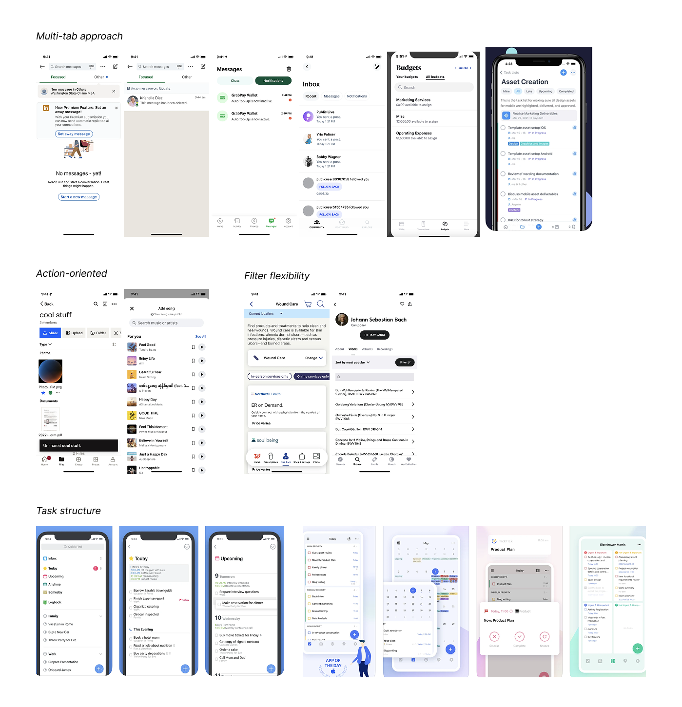
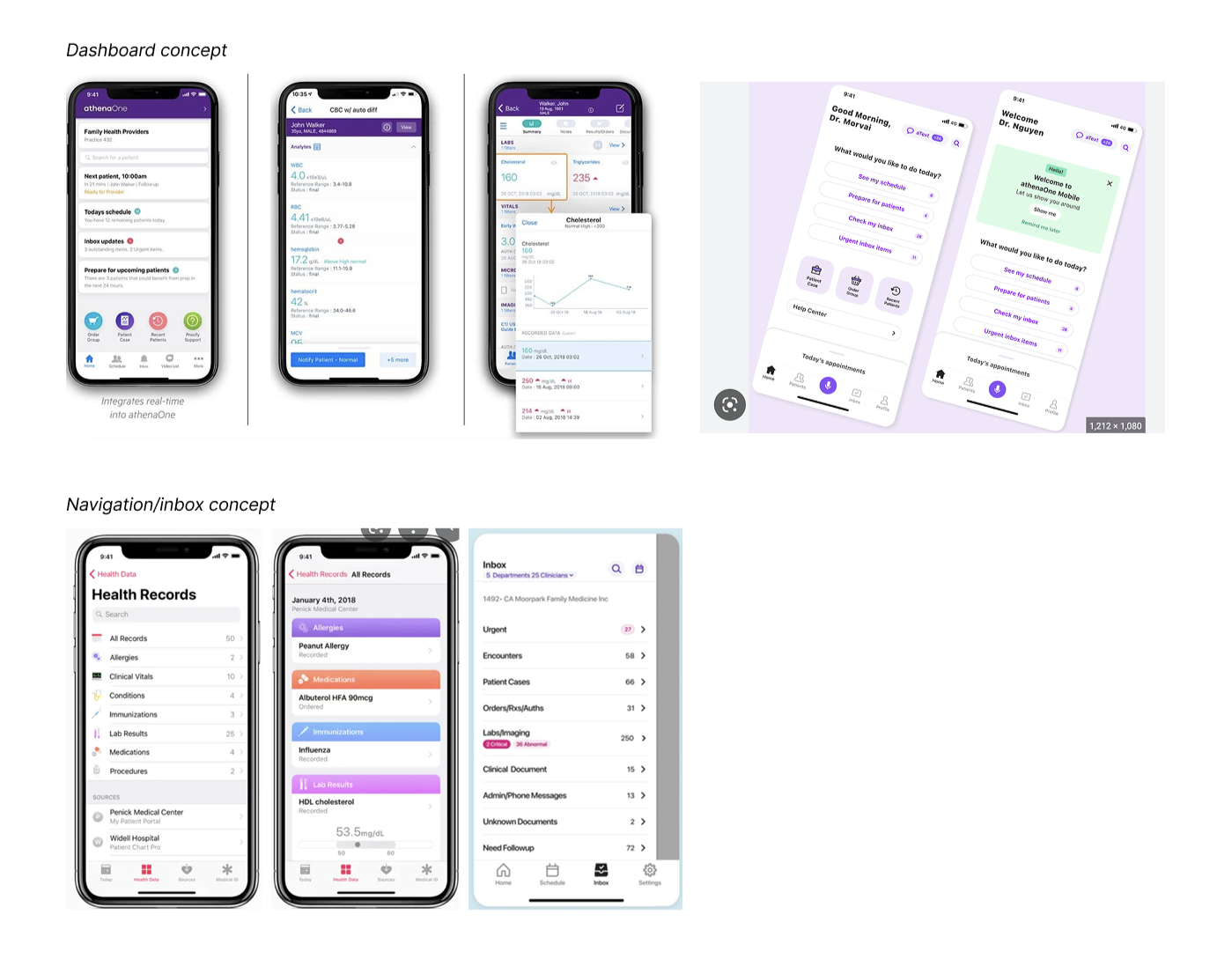
…examining how competitor mobile EHR systems and other general mobile apps display their clinical workflows.
03 Ideating and iterating
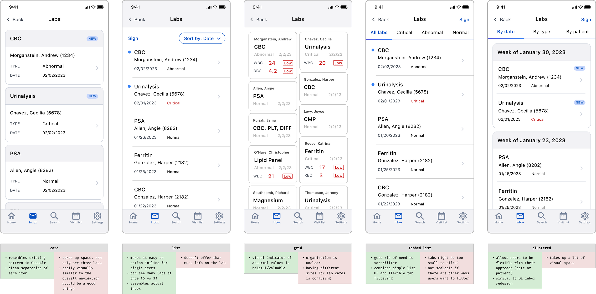
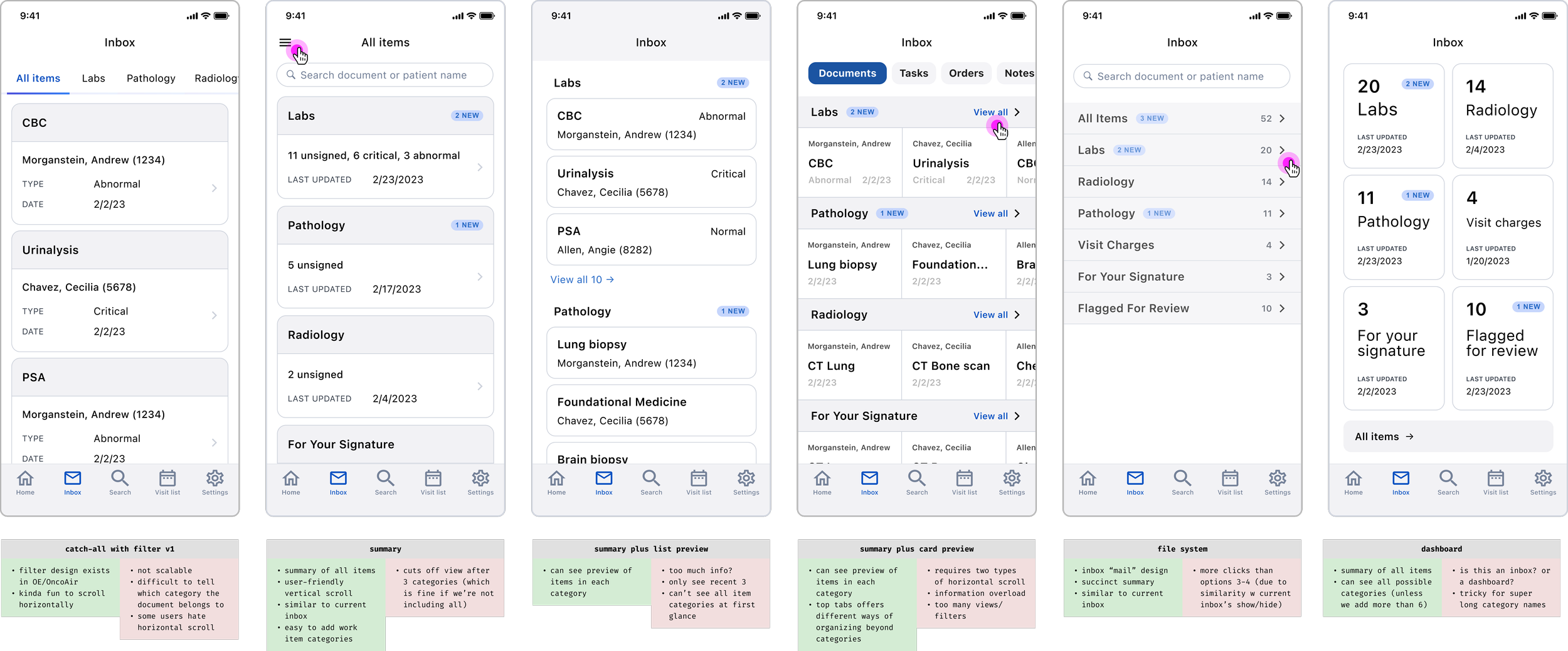
…exploring layout directions and refining a solution that balanced mobile simplicity with the familiarity of desktop inbox.
04 Validating hypotheses
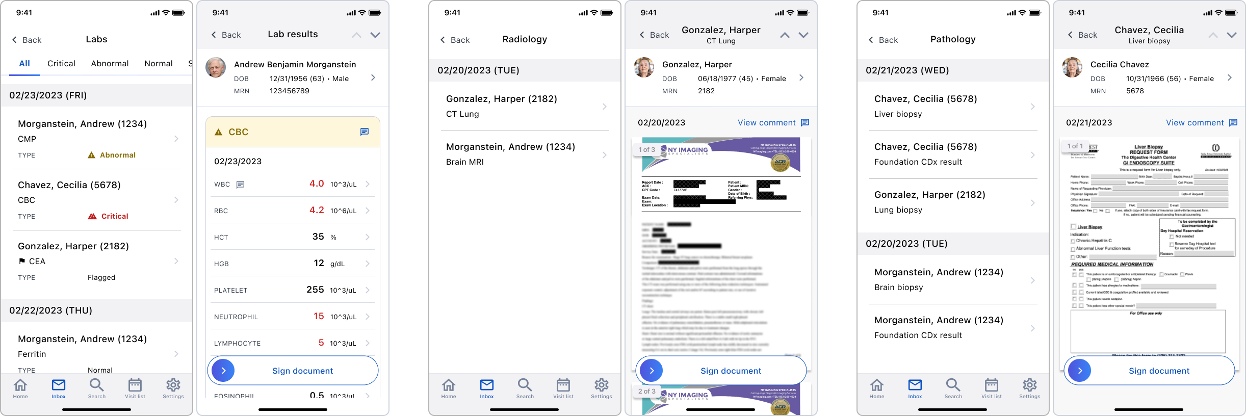
…conducting validation calls with physicians to stress-test our assumptions and finalize design based off real behavior.
High-level summary
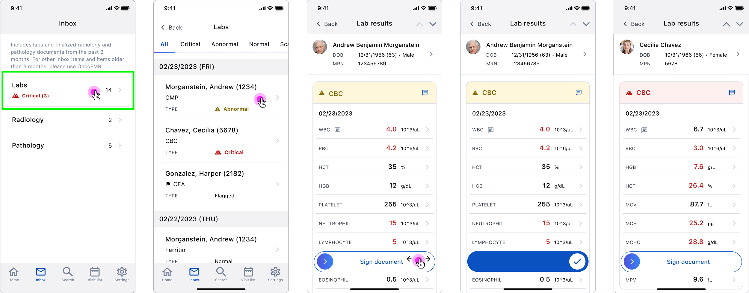
The landing page of the mobile inbox displays the number of outstanding items in each category, helping physicians manage their time and workflow expectations.
Priority views
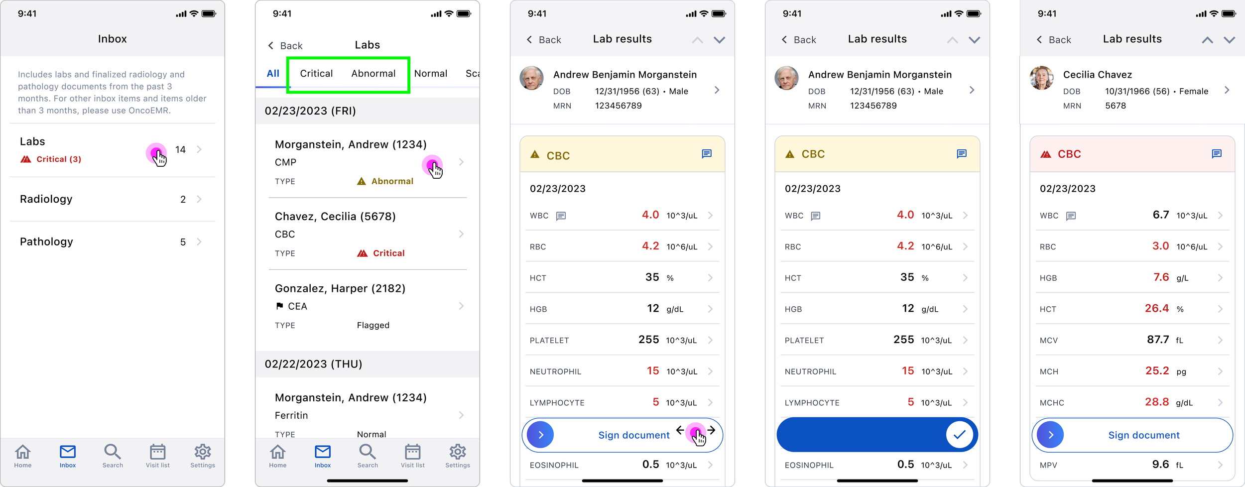
Each section in the inbox organizes items by priority, helping physicians quickly find and review urgent items.
Quick actioning
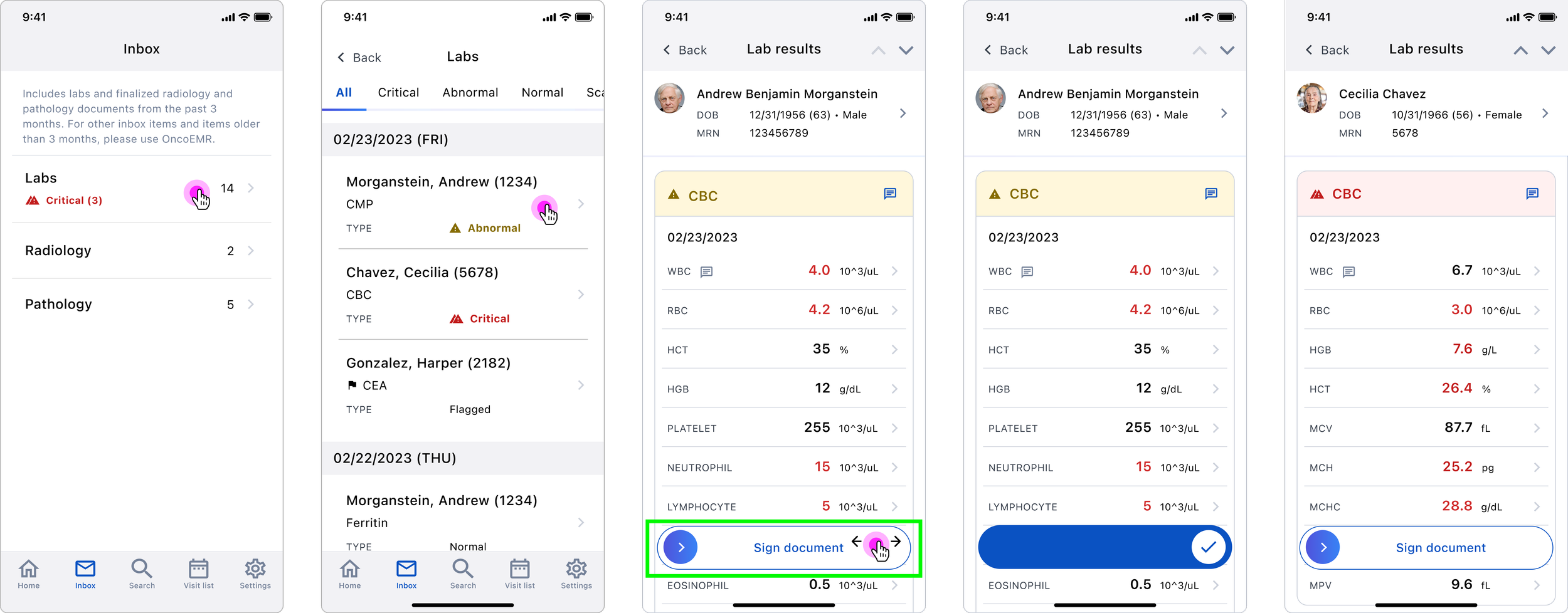
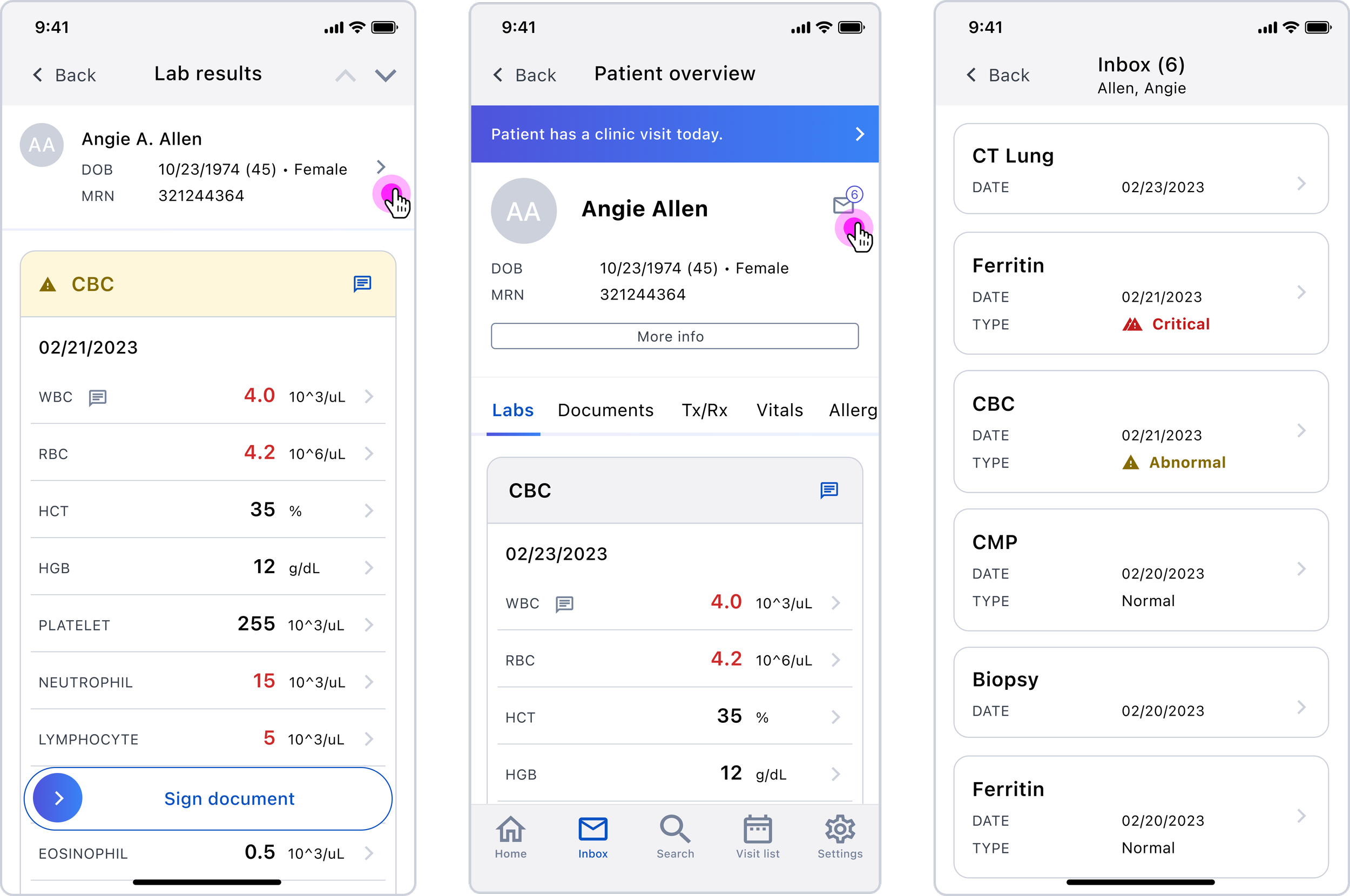
A simple swipe-to-sign pattern rests at the bottom of each document so physicians can quickly sign off on-the-go.
Patient view focus
To review their inbox one patient at a time, users can now navigate to the patient’s chart, which surfaces the patient’s outstanding items in the physician’s inbox.
End-to-end prototype
Dr. Arrowsmith, medical director at Tennessee Oncology —